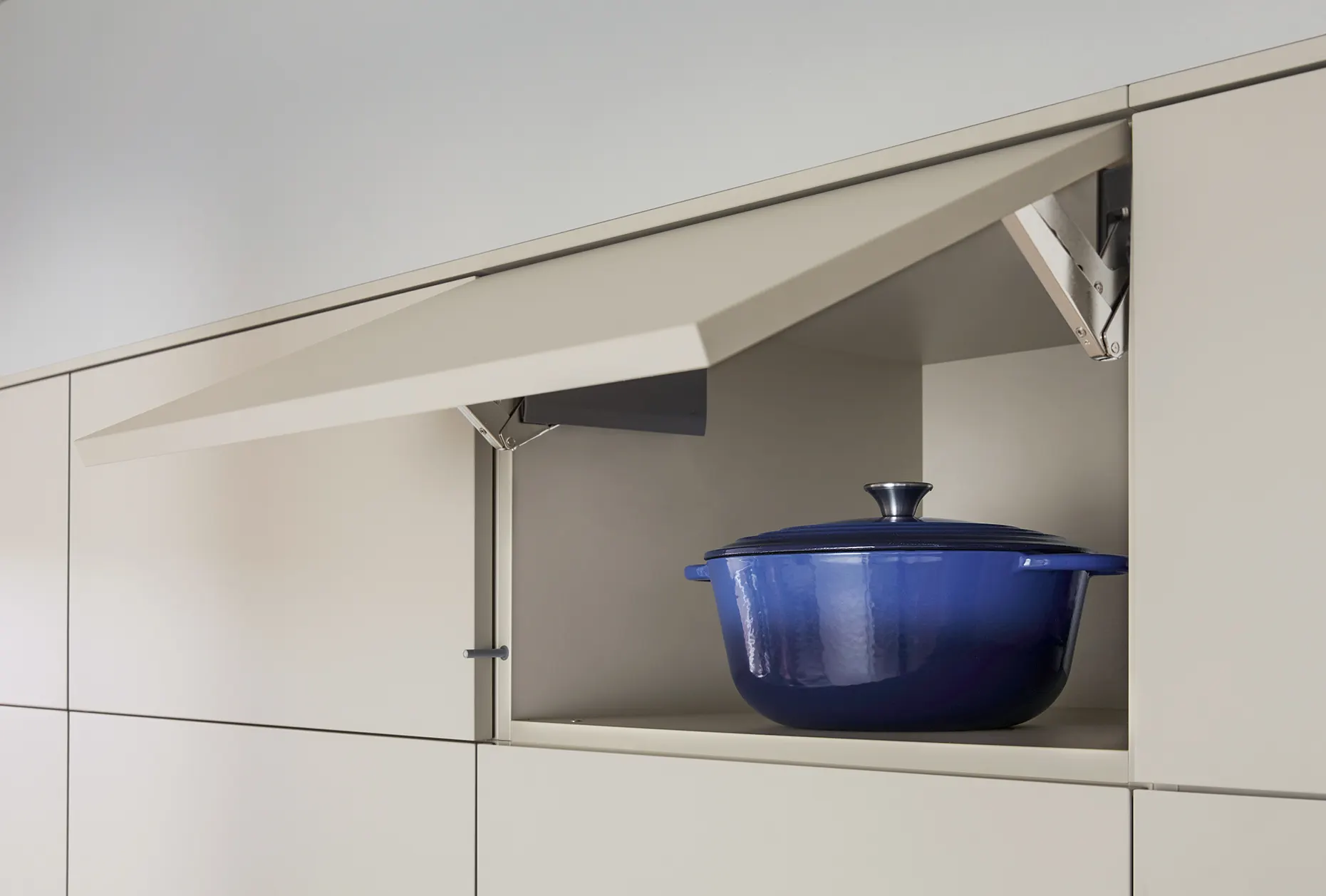

The best handleless cabinetry finish depends on your room’s light, how heavily the kitchen is used and how visible you want marks to be. Matt, gloss, textured, wood-effect and painted finishes each create different effects, so compare the cabinet face separately from the J-pull, recessed rail or profile before approving samples.
A finish affects more than colour. It changes how light moves across the room, how fingerprints and grease appear, how warm the cabinetry feels and how it relates to stone, flooring and appliances.
Finish Versus Grip: Three Decisions That Are Easy to Confuse
A handleless kitchen involves three related decisions: the visible cabinet-face finish, the door shape and the method used to open the door or drawer.
The cabinet-face finish
This is the surface you see and touch. It may be matt, gloss, textured, wood-effect, painted or lacquered, depending on the selected manufacturer and range.
The door style
A slab door has a flat, continuous face and usually gives the most streamlined appearance. A Shaker door adds a framed profile while retaining the convenience of handleless opening. J-pull doors incorporate an integrated finger pull into the door edge, while recessed rails and Gola-style channels create separate opening details.
The profile or channel finish
Black, aluminium and brushed-brass profiles each change the character of the room. A dark profile can sharpen pale cabinetry, aluminium can keep the arrangement quiet and technical, while brushed brass can introduce warmth. Matching the profile to taps or appliances is an option, not a rule.
For a bespoke scheme, begin with how the room is used and what needs to be stored, then choose the visual language. Bespoke cabinetry works best when proportions, storage, surfaces and appliances are considered together.
Handleless Cabinet Finishes Compared

No finish is best for every kitchen. The useful comparison is how each surface handles reflection, visible marks, texture, warmth and coordination with the rest of the room.
| Finish | Visual effect | Marks, grease and water | Cleaning and edge considerations | May suit | Trade-off |
|---|---|---|---|---|---|
| Matt or supermatt | Quiet, soft reflection | Reduces glare, though pale or smooth surfaces can still show contact marks and dark finishes can show dust, pale grease or dried water | Usually gives a calm visual field, but the exact coating determines how easily greasy marks lift. Check exposed edges and the opening detail for wipe access | Open-plan rooms and understated schemes | Can make a dark room feel heavier |
| Gloss | Reflective and crisp | Fingerprints, splashes, grease and smears can be more noticeable, especially when light falls directly across the doors | Flat faces are straightforward to wipe, but streaks can remain visible. Inspect the polished edge and corner finish for consistency | Smaller or darker rooms where reflected light helps | Visible cleaning is more frequent |
| Textured | Tactile depth and visual variation | Fine texture can break up the appearance of small marks, while deep grooves may hold crumbs, grease or moisture | Clean in the direction of the texture with the approved cloth and cleaner. Look closely at profiled edges, joints and channels where residue can collect | Large runs and busy kitchens | Can compete with strongly patterned stone |
| Wood-effect | Warmth and natural character | Grain can disguise small smudges, but pale streaks or water marks may still show across a dark or strongly directional pattern | Grain direction affects wiping and how dirt is seen. Check how the edge banding, end panels and joins continue the pattern | Warm contemporary and open-plan rooms | Several timber tones can look disconnected |
| Painted or lacquered | Controlled colour and furniture-like appearance | Visibility depends on colour and sheen. Dark, high-sheen and very pale surfaces can all reveal different types of contact, grease or water marks | Sheen, edges, repairs and variation depend on the specified system. Ask how the coating continues around edges and how replacement fronts would be matched | Colour-led interiors and Shaker doors | Availability and repair options are range-specific |
These are general tendencies, not guarantees for every door. The substrate, coating, colour, sheen, edge treatment and cleaning instructions can change how a finish performs. A textured surface may hide a fingerprint but require more attention in its grooves, while a smooth matt door may wipe easily yet show a pale streak under strong side lighting.
Matt versus gloss
Matt cabinets create a softer, quieter backdrop. Gloss cabinets reflect more of the room and can help a compact or poorly lit kitchen feel brighter, but highlights can make fingerprints, grease and water marks easier to notice.
Colour, texture, lighting direction and the exact product finish all affect what you see. A sample under a showroom spotlight may look different beside a window at home.
Textured and wood-effect finishes
Textured finishes can prevent a long run of cabinetry from appearing flat. Wood-effect cabinetry introduces warmth without requiring every surface to be timber. Check grain direction across doors, drawers and tall units.
For everyday cleaning, compare the texture at the points you touch most often, such as drawer fronts below the worktop and doors beside the sink. A shallow texture is generally easier to wipe than a deep, open grain, but the selected range’s care instructions take priority.
Painted and lacquered finishes
Painted or lacquered doors are useful when colour is central to the brief. Ask how the finish is applied, how exposed edges are treated and what happens if a door is damaged.
Look for consistent colour and sheen across the face, edge and end panel. A finish that appears uniform on one small sample can read differently across a tall door or island, particularly where daylight strikes at an angle.
Choose by Room, Light and Household Routine
Choose the finish by identifying the strongest constraint in your room: brightness, low visual clutter, warmth, reduced visibility of everyday marks or strong architectural contrast.
If the room is small or poorly lit
A pale gloss can reflect available light, while a pale matt finish can keep the room calm without adding glare. Layout and lighting matter as much as the door surface. Review samples beside the proposed floor and worktop.
If the kitchen is used heavily by a family
Prioritise the finish that makes everyday marks manageable for your household. A mid-tone matt, subtle texture or restrained wood-effect surface may make small smudges less prominent than a dark, highly reflective door.
Place extra scrutiny on the areas most likely to receive greasy fingerprints: bin units, dishwasher panels, drawer fronts near the hob and doors beside the sink. The easiest finish to live with is often the one that balances wipeability with acceptable mark visibility, not simply the one described as matt or textured.
If the kitchen is open to living areas
In an open-plan room, cabinetry is part of the wider interior. A quiet matt finish can recede, while wood-effect or painted doors can make the kitchen feel more like fitted furniture. View the finish from the sofa, dining table and entrance, not only from the working side of the island.
If you want a dramatic dark kitchen
Dark matt or textured cabinetry needs considered lighting and tonal variation. A lighter worktop, warm wall colour, timber detail or carefully placed profile can prevent a long dark run from becoming visually dense.
Dark finishes also make dust, dried splash marks and edge chips more noticeable in some lighting. If you prefer a dramatic colour but want less visual maintenance, compare a mid-tone textured sample with a flat, high-sheen dark sample before deciding.
Coordinate the Finish With the Rest of the Kitchen
Assess the cabinet finish as part of a composition. The main relationships are sheen, colour temperature, pattern scale and visual weight. A high-sheen cabinet, polished surface and reflective appliance create a brighter, more energetic room, while matt cabinetry, honed stone and timber produce a quieter result.
Worktops and splashbacks should be considered alongside the doors. Strongly veined stone may need a restrained cabinet face, while a plain worktop can give a textured or wood-effect door more room to contribute character.
Integrated appliances should be included in the visual check. Consider whether appliance fronts disappear into the run, interrupt the finish or become a deliberate focal point. The same applies to sinks, taps, lighting and the profile. This wider approach to cabinetry finish options considers configuration, storage, appliances and visible surfaces across the whole kitchen.
Use the profile to control contrast. A colour-matched channel creates a continuous line, aluminium adds a cooler technical note, black makes the opening detail graphic and brushed brass introduces warmth. Matching every metal is not essential, but repeating one finish in two or three visible details usually creates a more deliberate scheme.
Three Coherent Finish Schemes to Test
These hypothetical combinations are starting points for a sample discussion.
Restrained neutral
Pair pale matt cabinetry with a calm quartz or mineral-effect worktop and a discreet aluminium or colour-matched profile. This suits an open-plan room where the cabinetry should not dominate.
Warm contemporary
Combine a muted painted or lacquered base with wood-effect tall units or an island. A warm stone surface and restrained metal detail can connect the kitchen to adjoining living furniture.
High contrast
Use dark matt or textured cabinetry with a lighter worktop and a deliberately visible black or brushed-brass profile. High contrast makes junctions and alignment more noticeable, so these details need to be resolved before production.
What to Check in a Physical Sample

Do not approve a handleless finish from a screen image alone. A sample reveals sheen, texture, edge treatment and colour relationships that digital images cannot show reliably.
- View it in natural daylight and planned artificial lighting.
- Hold it beside the worktop, splashback, flooring, wall colour and appliance finish.
- Look straight on and at an angle to see how reflection changes.
- Inspect the front edge, corners and junction with the J-pull, rail or channel.
- Handle it to see how contact marks appear. This is an observation, not a durability test.
- Check grain, texture and colour consistency across the intended door sizes.
- Ask for the exact manufacturer, range, finish name and colour reference.
- Request written cleaning guidance for the door face and profile.
- Ask how damaged or replacement fronts would be handled.
Resolve Technical Details Before Cabinetry Is Ordered
Finish approval should happen alongside the technical design. The visible result depends on cabinet proportions, appliance housing, profile alignment, worktop edges, sockets, lighting and the way tall units meet islands or adjoining furniture.
A sensible sequence is to define routines and storage needs, develop the layout in 3D, compare physical finishes, coordinate appliances and surfaces, then approve technical drawings. A site survey and final production checks should confirm the room and services before manufacture.
Accurate room information supports these decisions. This guide to cabinet planning measurements explains the dimensions, openings, services and obstacles worth recording before a detailed layout is developed.
Before ordering, confirm the selected finish, profile, door style, appliance fronts, worktop edges and cleaning requirements in the written specification. The 3D layout and physical stone and lacquer samples should be reviewed together so the visual decision reflects the proposed proportions and surrounding materials.
Questions to Take to a Kitchen Designer
- Which exact manufacturer and range offers this finish?
- How will it appear on large doors, drawers, tall units and appliance panels?
- What edge treatment is used, and how does it meet the opening detail?
- Which marks are likely to be visible in my lighting and routine?
- What cleaning method is approved?
- How are damaged or replacement fronts handled?
- Should the profile match, blend with or contrast against taps and appliances?
- How will the finish relate to the worktop, splashback, flooring and adjoining furniture?
- Can I view a larger sample or elevation showing the proposed proportions?
- When are the finish, profile, appliances, worktops and drawings finally approved?
If you are visiting a showroom, take a brief covering who cooks, what creates clutter, how the kitchen connects to other rooms and which materials you already plan to keep. This German kitchen showroom visit guide can help you prepare.
A More Confident Finish Shortlist
Start with the room and routine, then shortlist the finish. Choose matt or subtle texture for controlled reflection, gloss when reflected light is valuable, wood-effect when warmth matters, and painted or lacquered cabinetry when a precise colour-led scheme is the priority. Treat the profile and door shape as separate decisions, then test the full combination beside the worktop, floor and appliances.
For homeowners ready to compare cabinetry, surfaces and integrated appliances as one coordinated scheme, MODENHAUS Kitchens & Interiors provides tailored kitchen design from its Ruislip studio for homes across Greater London and the Home Counties.